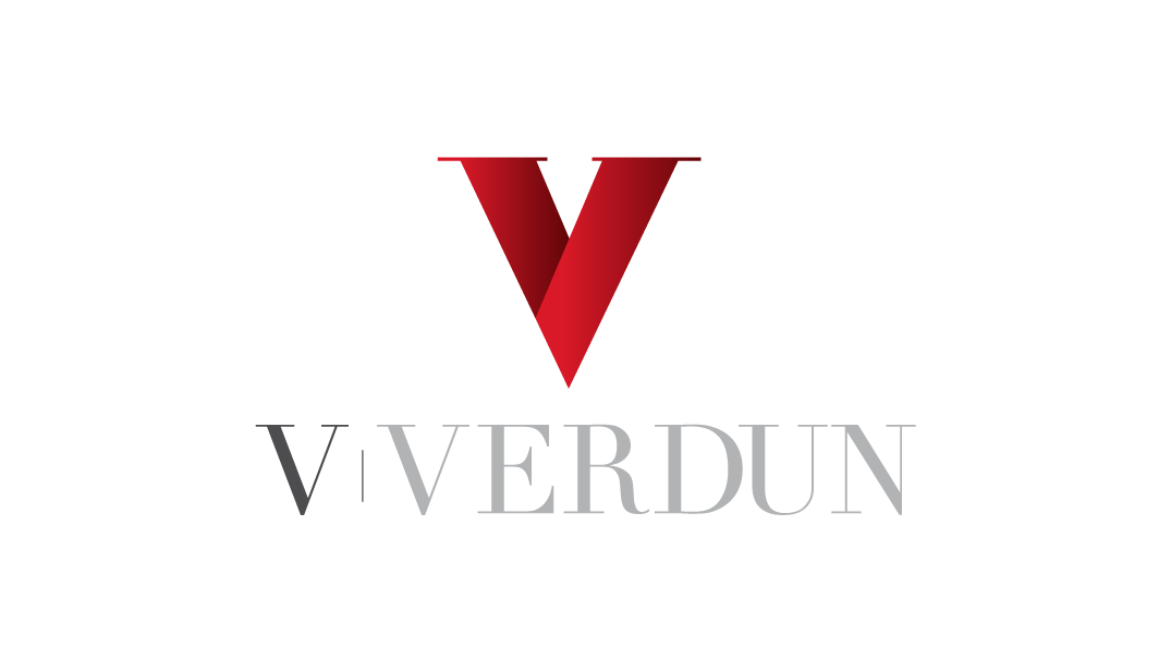
V Verdun
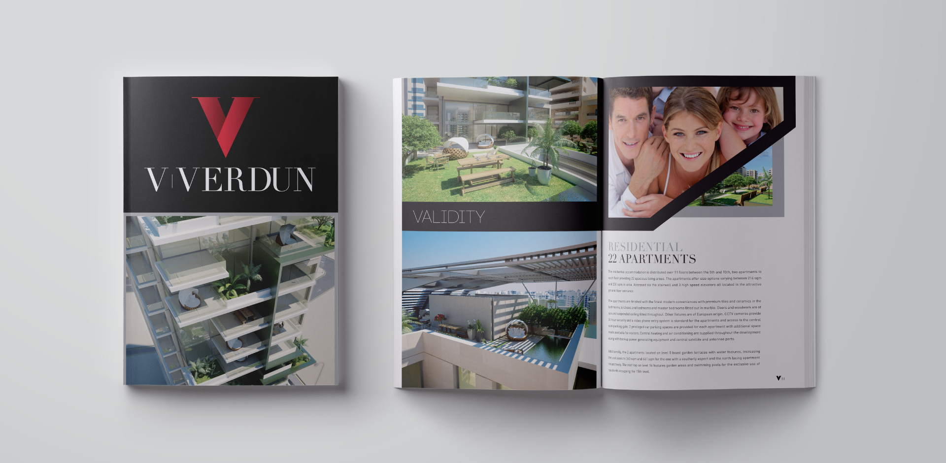
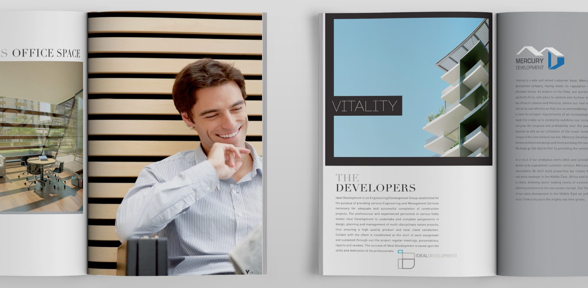
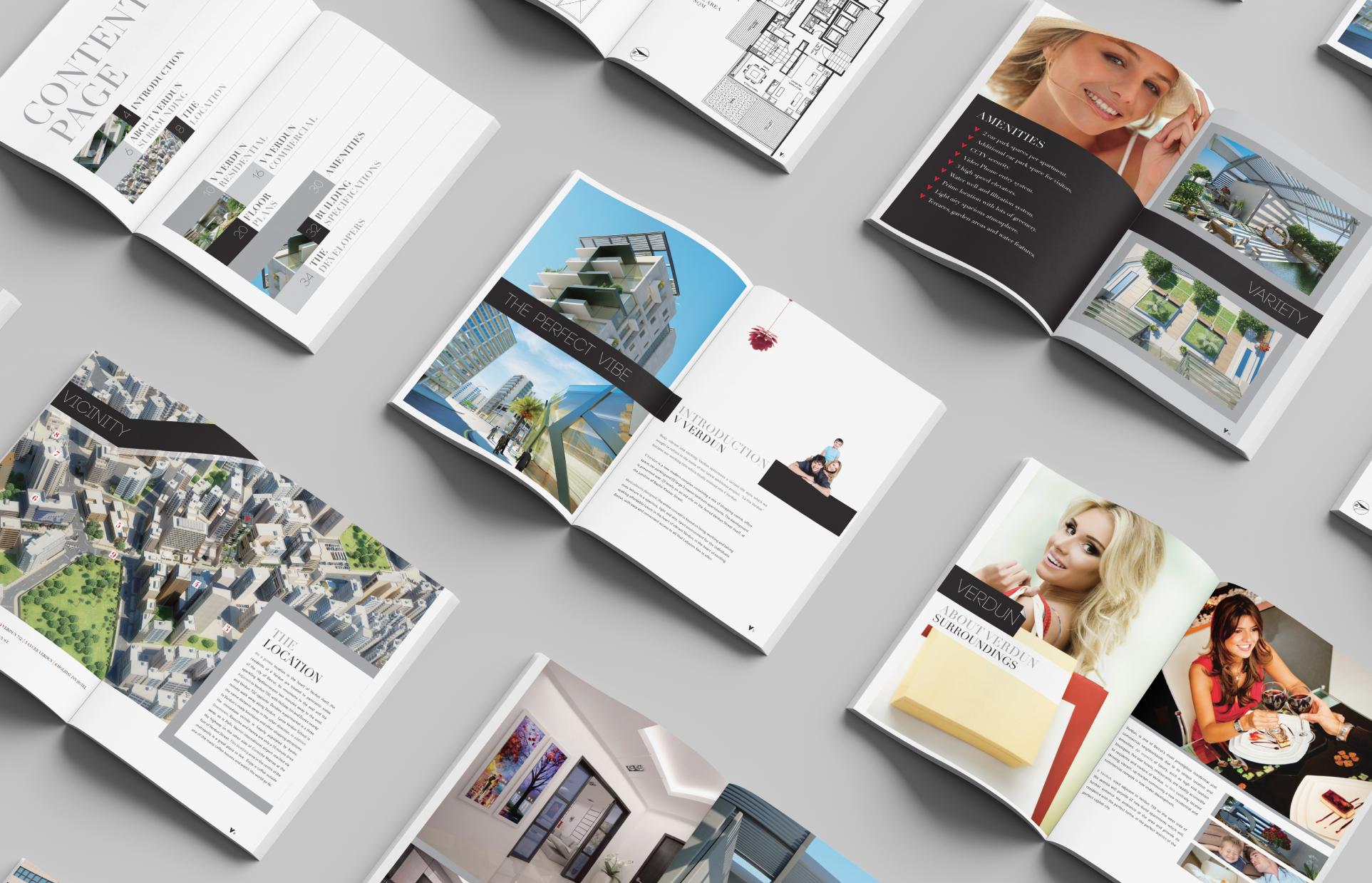
Within the heart of Beirut is a sought-after location that gives way to a development that intertwines both commercial and residential. When it comes to architecture, V Verdun is the definition of vision, from natural light pouring through windows to nature surrounding modern design. We crafted an elegant yet modern brand direction, with a bespoke logotype to represent just that. The sleekness and validity of its structure inspires a holistic branding with strong, bold outlines. The colour palette brings life to concrete, using silver, black and red to symbolise what the project brings to its community, stability, energy and the feeling of being grounded.
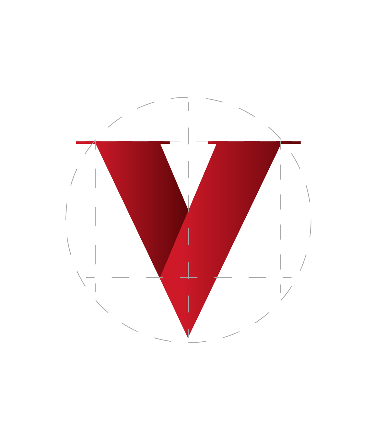
V Verdun
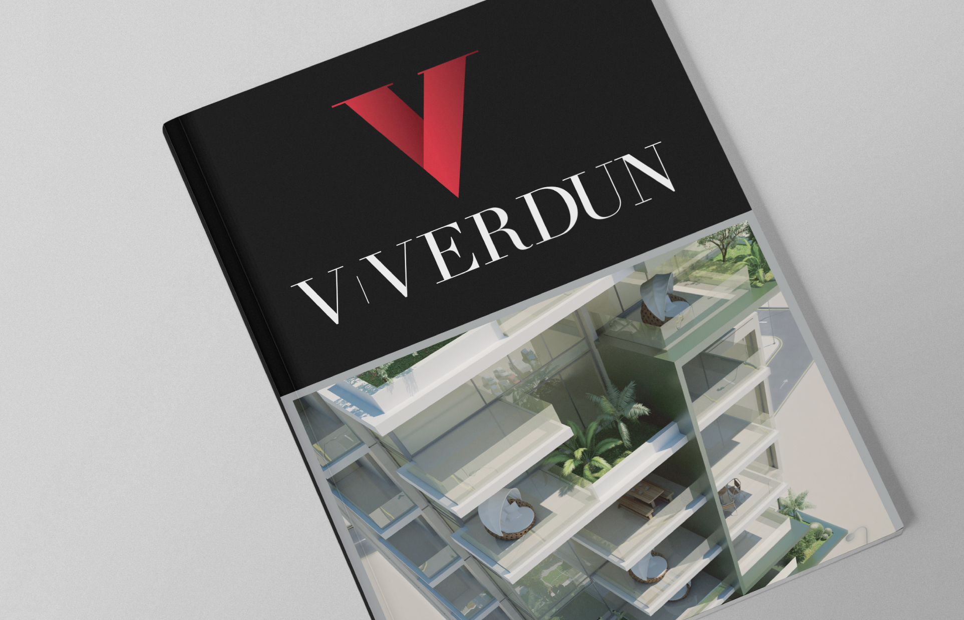
Within the heart of Beirut is a sought-after location that gives way to a development that intertwines both commercial and residential. When it comes to architecture, V Verdun is the definition of vision, from natural light pouring through windows to nature surrounding modern design. We crafted an elegant yet modern brand direction, with a bespoke logotype to represent just that. The sleekness and validity of its structure inspires a holistic branding with strong, bold outlines. The colour palette brings life to concrete, using silver, black and red to symbolise what the project brings to its community, stability, energy and the feeling of being grounded.
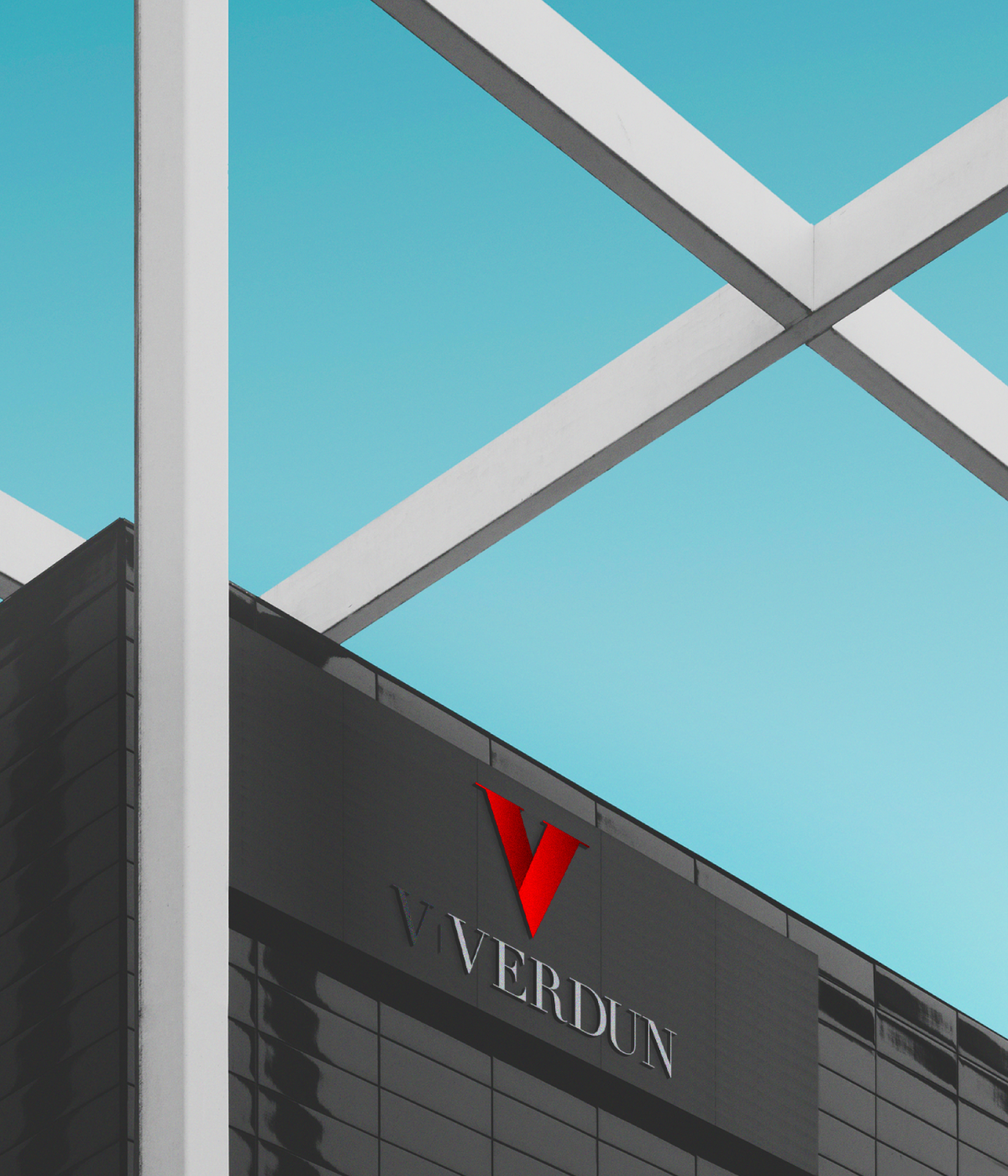
V Verdun
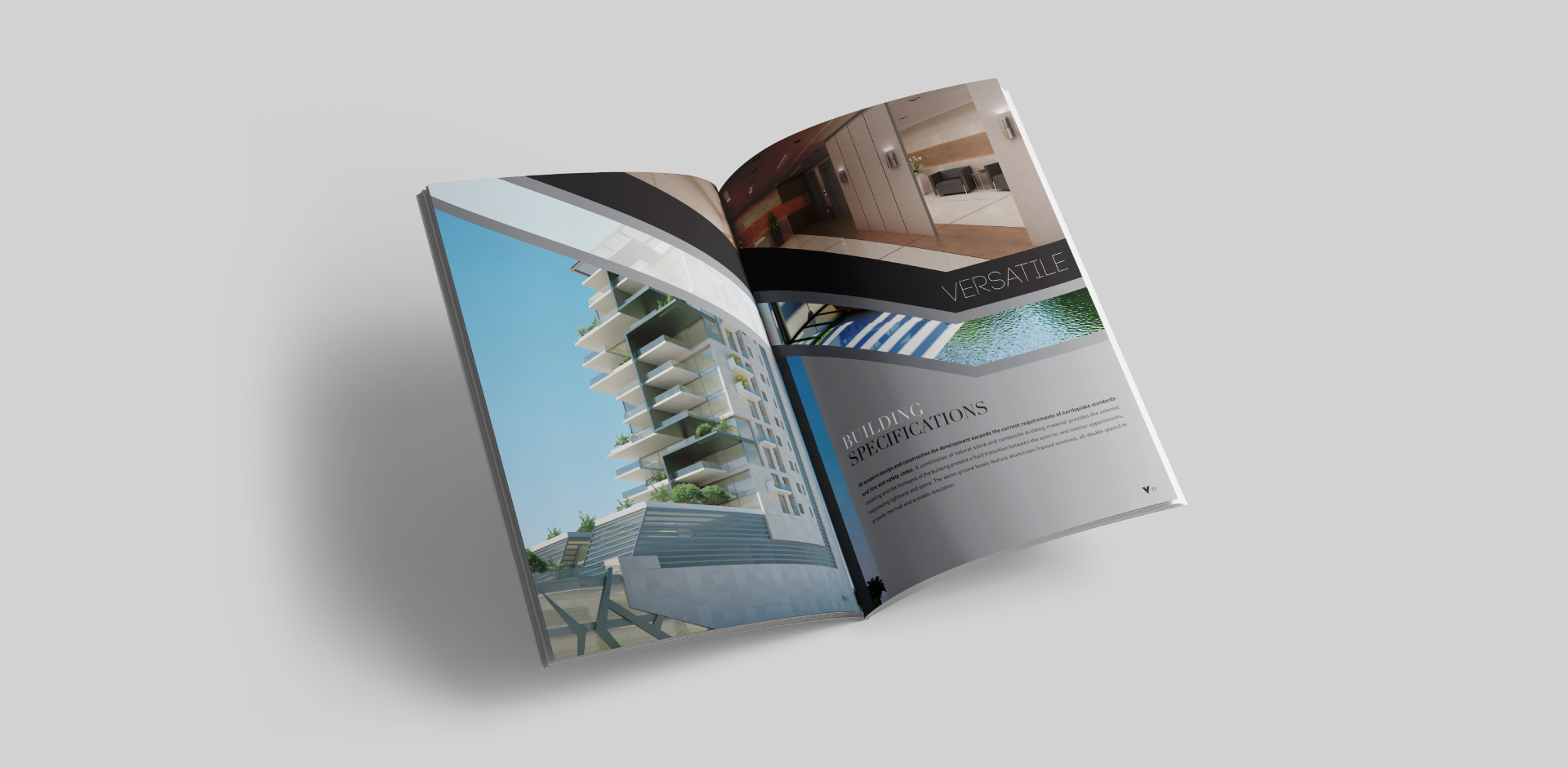
Within the heart of Beirut is a sought-after location that gives way to a development that intertwines both commercial and residential. When it comes to architecture, V Verdun is the definition of vision, from natural light pouring through windows to nature surrounding modern design. We crafted an elegant yet modern brand direction, with a bespoke logotype to represent just that. The sleekness and validity of its structure inspires a holistic branding with strong, bold outlines. The colour palette brings life to concrete, using silver, black and red to symbolise what the project brings to its community, stability, energy and the feeling of being grounded.
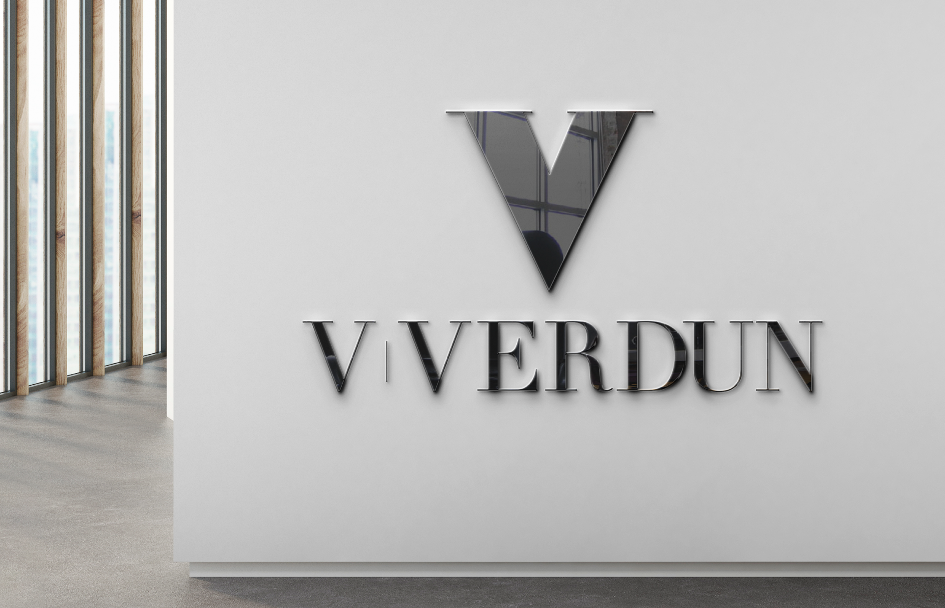
V Verdun
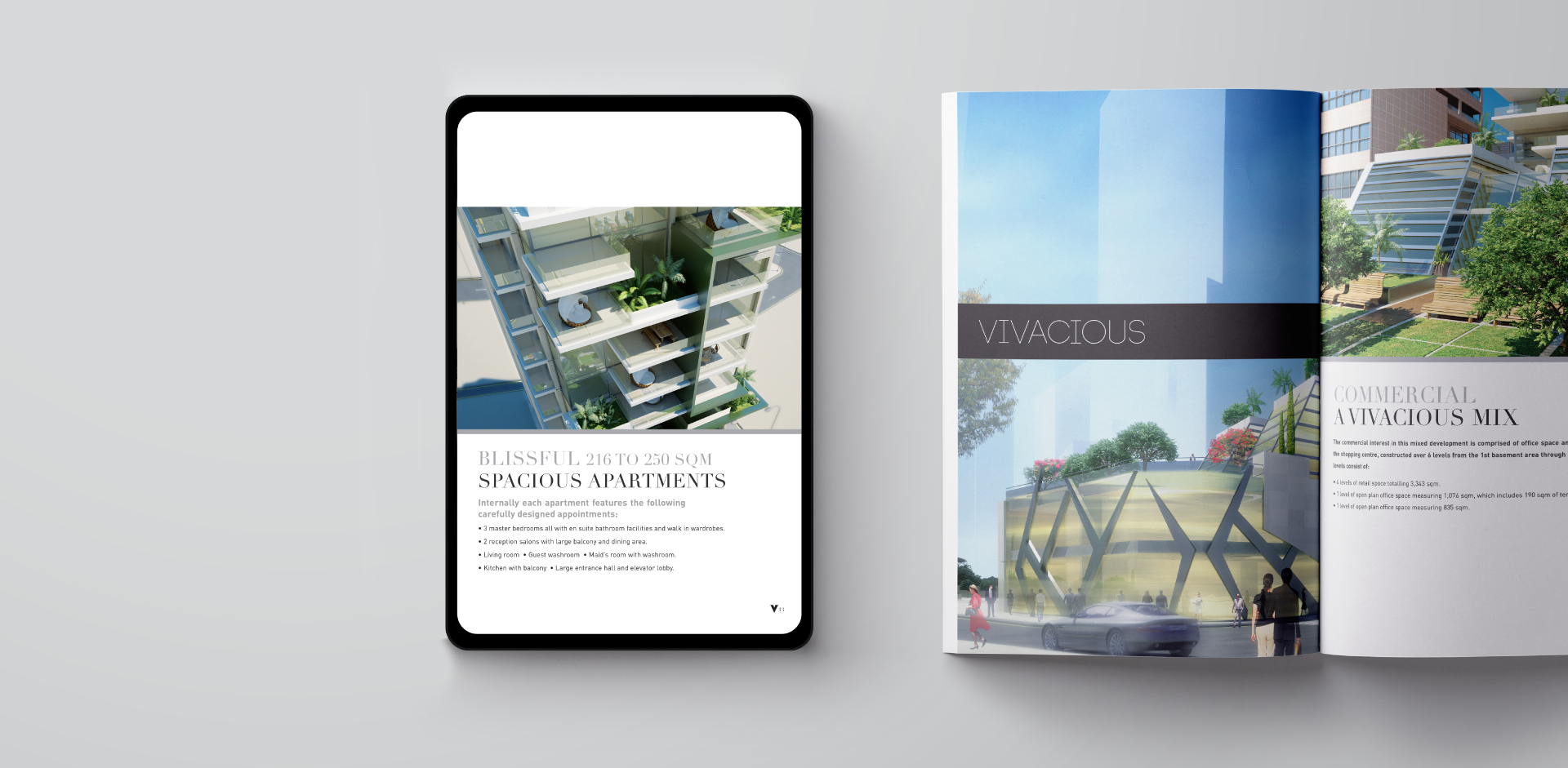
Within the heart of Beirut is a sought-after location that gives way to a development that intertwines both commercial and residential. When it comes to architecture, V Verdun is the definition of vision, from natural light pouring through windows to nature surrounding modern design. We crafted an elegant yet modern brand direction, with a bespoke logotype to represent just that. The sleekness and validity of its structure inspires a holistic branding with strong, bold outlines. The colour palette brings life to concrete, using silver, black and red to symbolise what the project brings to its community, stability, energy and the feeling of being grounded.